I have a sequence of articles inside a div of 4+ length, without any rounding row tag. I need to represent it as a table of 3 articles (columns) per row, probably with display: grid. Every article has a header, a section and a footer.
How would I implement an equal height for each header, an equal height for each section, and an equal height footer, aligned to the bottom of the article, inside each row of articles? Is it even possible? Should I use display: table?
PS I need to change the number of articles per row dynamically, depending on screen width. Thanx.
HTML:
body { width: 100%; max-width: 1024px; margin: auto;}.container { display: grid; grid-template-columns: repeat(3, 1fr);}.container article { display: grid;}article header { background-color: #eeeeee;}article section { background-color: #cccccc;}article footer { background-color: #dddddd;}<div class="container"><article><header><h2>Header</h2><h2>Header</h2></header><section><p>Content</p></section><footer><p>Footer</p></footer></article><article><header><h2>Header</h2></header><section><p>Content</p><p>Content</p><p>Content</p><p>Content</p><p>Content</p></section><footer><p>Footer</p><p>Footer</p></footer></article><article><header><h2>Header</h2></header><section><p>Content</p><p>Content</p><p>Content</p></section><footer><p>Footer</p></footer></article><article><header><h2>Header</h2></header><section><p>Content</p><p>Content</p><p>Content</p><p>Content</p></section><footer><p>Footer</p><p>Footer</p></footer></article></div>NB: JS is deprecated.
https://codepen.io/yudnikov/pen/mBvbGW?editors=1100#0
grid-auto-rows: 1fr; has been proposed as a duplicate, which it is not. It will only give the articles equal height, while e.g. the headers of each article remains differently sized.
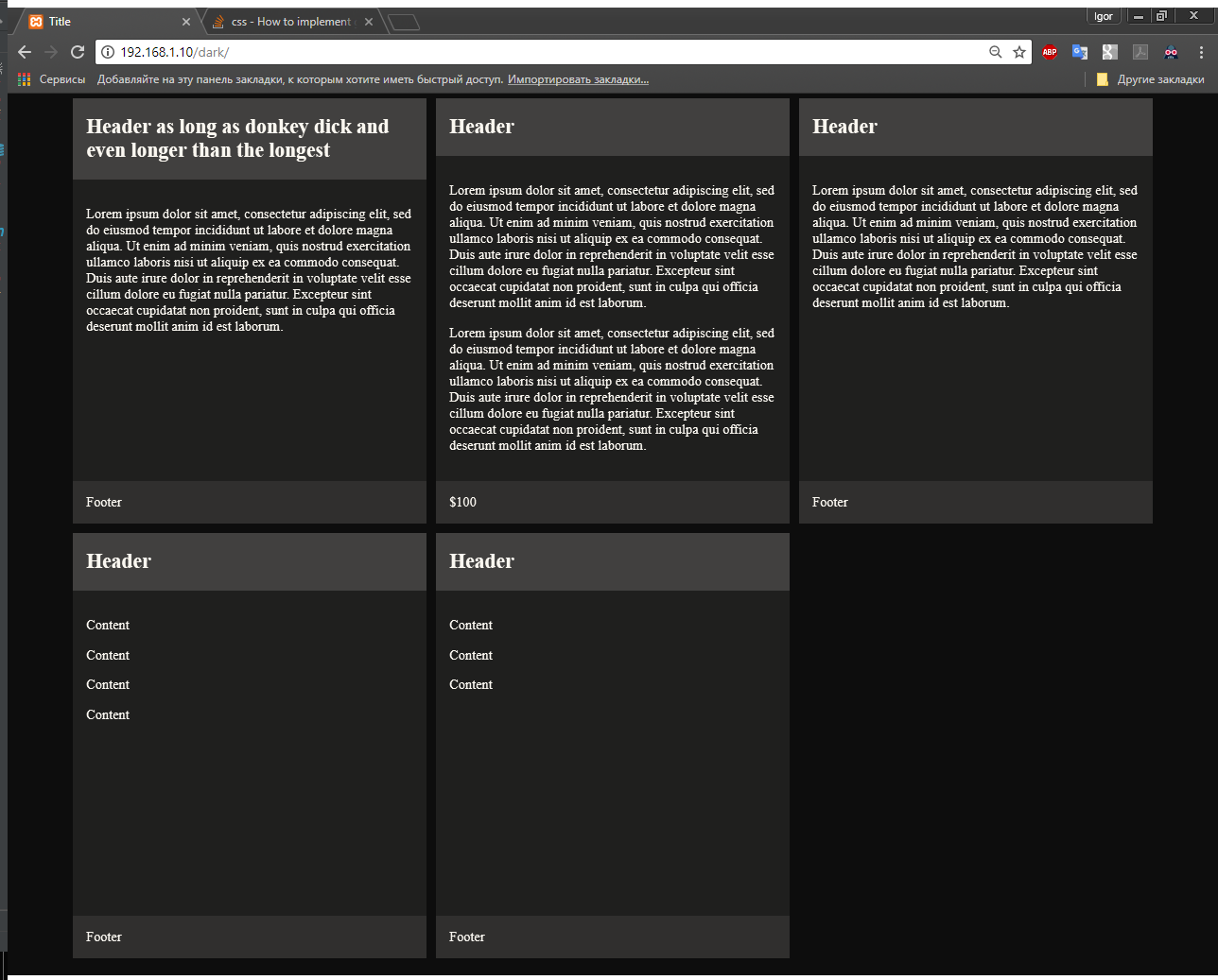
I originally had this problem:
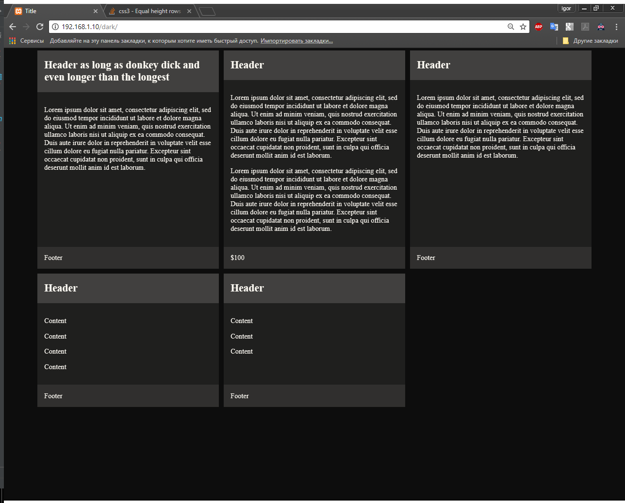
And the grid-auto-rows: 1fr solution results in this: